The FTC's New Click-to-Cancel Rule, Amazon Prime, and the Future of Subscriptions

Introduction
Earlier this month, the Federal Trade Commission (FTC) announced a new rule that will significantly impact commerce across America: the Click-to-Cancel rule. In this post, I'll break down the rule, explain why it was implemented through a case study based on active FTC litigation involving Amazon Prime, and explore its implications for the web and commerce.
Part 1: What is the Click-to-Cancel rule, and why was it created?
The Click-to-Cancel rule requires companies to make it just as easy for consumers to cancel their subscriptions as signing up. The goal of the rule is to protect consumers from manipulative tactics designed to trap them in subscriptions they no longer want or need. According to FTC Chair Lind Kahn:
“Too often, businesses make people jump through endless hoops just to cancel a subscription,” said Commission Chair Lina M. Khan. “The FTC’s rule will end these tricks and traps, saving Americans time and money. Nobody should be stuck paying for a service they no longer want.”
This simple rule follows the goals and philosophy of the CAN-SPAM Act (2003), which required email marketers to provide clear and easy ways to unsubscribe to counter the acceleration of spam. The Click-to-Cancel Rule is part of a broader effort by the FTC to address rising concerns about "dark patterns"—deceptive design tactics meant to manipulate users into making decisions they wouldn't otherwise choose.
It was clear some regulation was coming. In 2022, the FTC released a report on the rise of dark patterns, concluding that techniques used to trick or trap consumers were on the rise. In 2023, the FTC sued Amazon for using dark patterns with Amazon Prime.
To better understand the new FTC rule, let's dig into dark patterns.
Part 2: What are "dark patterns"?
Dark patterns are deceptive design practices used to manipulate user behavior, often to the advantage of the company or organization. Nobel Laureate and University of Chicago Professor Richard Thaler, the author of Nudge, would call this behavior, "sludge."
sludge, which is any unnecessary friction, is the opposite of helpful.
In essence, dark patterns are digital sludge. They introduce extra steps, confusion, or obstacles that trick you into doing things you don’t want to do or make it harder to stop doing something—like canceling a subscription.
There are many types of dark patterns, and anyone reading this will have spent enough time on the internet to have experienced many of the obvious ones, such as defaulting you in "opt-in" to share and sell your data when signing up for a service or burying the unsubscribe button in an email.
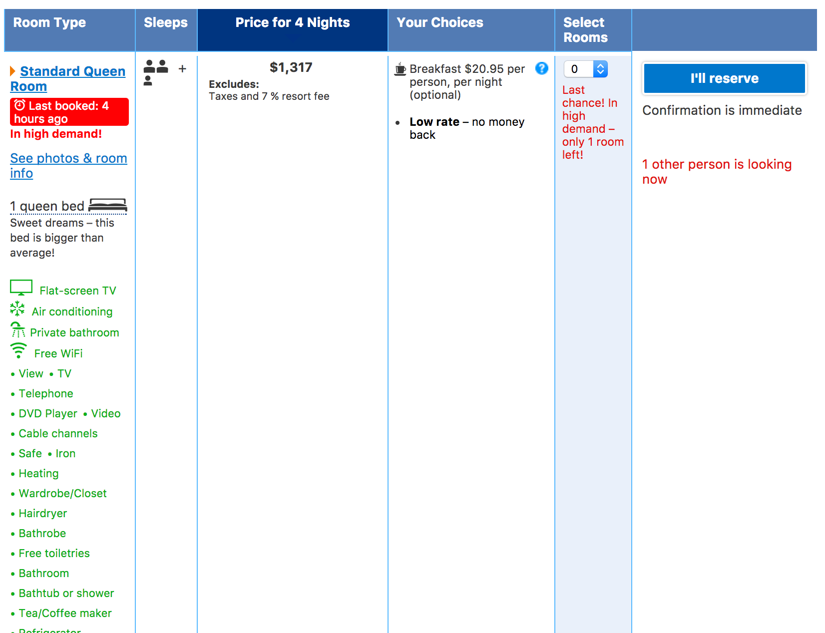
There are more subtle forms of dark patterns, too. For example, a screenshot below from a nameless hotel booking site. Notice the multiple calls to action in red? These are designed to instill:
- Urgency—someone else is looking at this same room right now! ("1 other person is looking", "only 1 room left")
- Scarcity—someone just booked, and there's only one left! ("in high demand," "last booked: 4 hours ago", "only 1 room left")
While these warnings might be authentic, it's impossible for us to independently verify them and pressure you into making a decision.
With that quick introduction to dark patterns, let's dive into their application to Amazon Prime.
Part 3: Subscription Dark Patterns and the Amazon Prime Lawsuit
The FTC sued Amazon in October 2023 for using dark patterns. From the Wall Street Journal (emphasis mine):
The FTC alleges that Amazon had a purposefully complicated cancellation system for Prime members that internally was code-named “Iliad” after the ancient Greek work by Homer. The epic poem is notoriously hard to read.
So, was Amazon's Prime cancellation experience really as bad as the FTC claims? Did it justify the lawsuit, or is the new FTC leadership being overzealous and trying to make a name for themselves by taking on a trillion-dollar business? Let’s find out.
I had a personal encounter with this back in September 2020 when I decided to cancel my Prime membership. It was not just annoying but an almost perfect display of dark patterns in action. In fact, I took screenshots to illustrate the process, originally intending to write a post about behavioral economics on the web.
Let’s break down the steps of canceling an Amazon Prime subscription and see how it matches the FTC’s allegations.
Step 0: Finding the Account Page
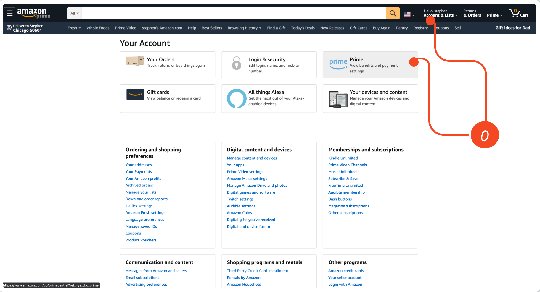
0: We start from the home page and click on "Account & Lists," taking us to the account page. In the upper right-hand corner, you can see a branded Prime card, which seems like a safe bet for us to go since the "Memberships and subscriptions" don't look promising. However, this page is filled with other options that could easily take you in a different direction if you’re in a hurry.
Stats
- Running Click Count: 2
- Running Screen Count: 2
Step 1: Account -> Prime Account
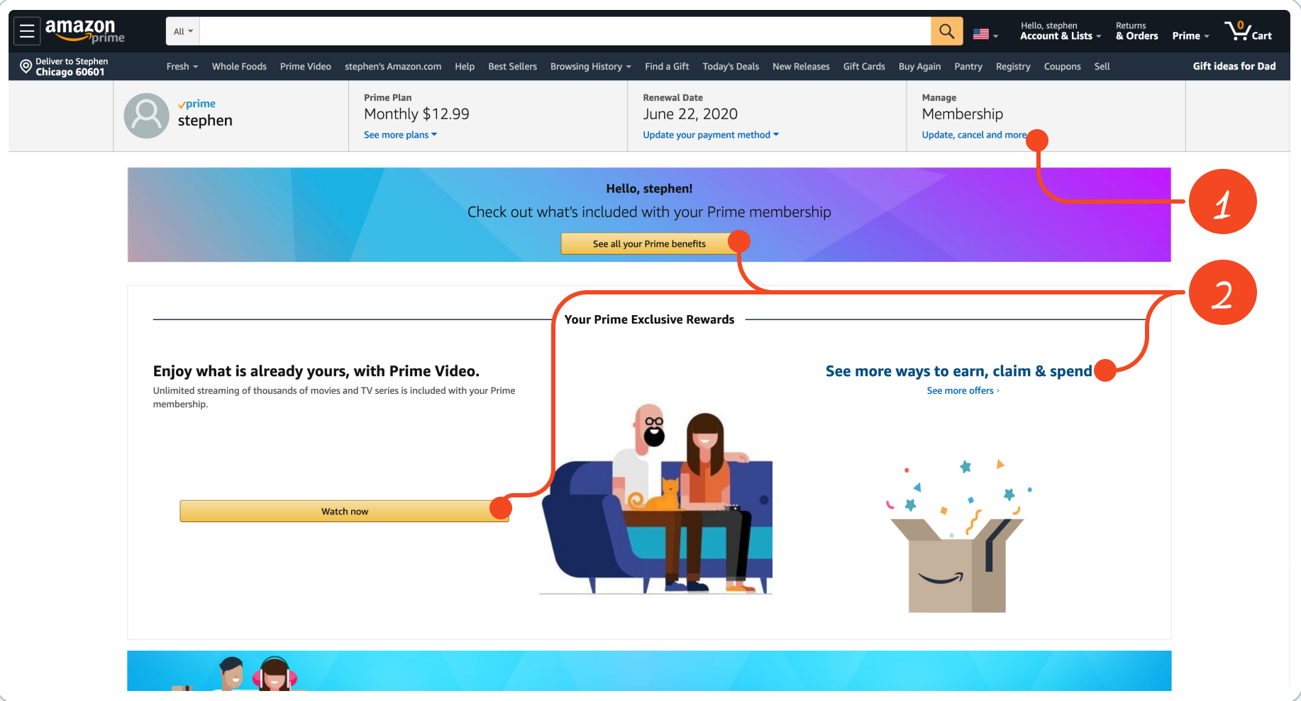
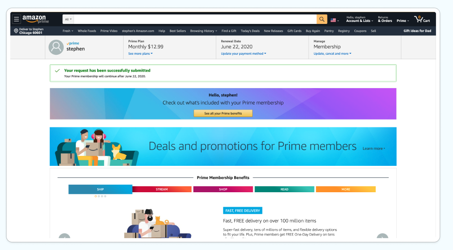
From a quick scan, we're in the right place. There are some details on my Prime plan, the renewal date... so far so good.
- It looks like there's a link to manage membership in the top right corner. This reveals a dropdown with a button to "End Membership." Bingo. It took a little searching, but we're in business.
- But while we are looking at this screen, notice how the header has a gigantic call to action to understand my Prime benefits with gigantic buttons. For customers who might only be using Prime for free shipping but aren't happy paying $119/year, this education might convince them to stick around. There is also a prominent call to action to watch Prime Video, which Amazon was trying to promote as an emerging, free service for subscribers.
No dark patterns here, FTC, just an oddly designed page.
Stats
- Running Click Count: 4 (+2)
- Running Screen Count: 4 (+2, including the dropdown)
Step #2: Prime Account -> Prime Benefits
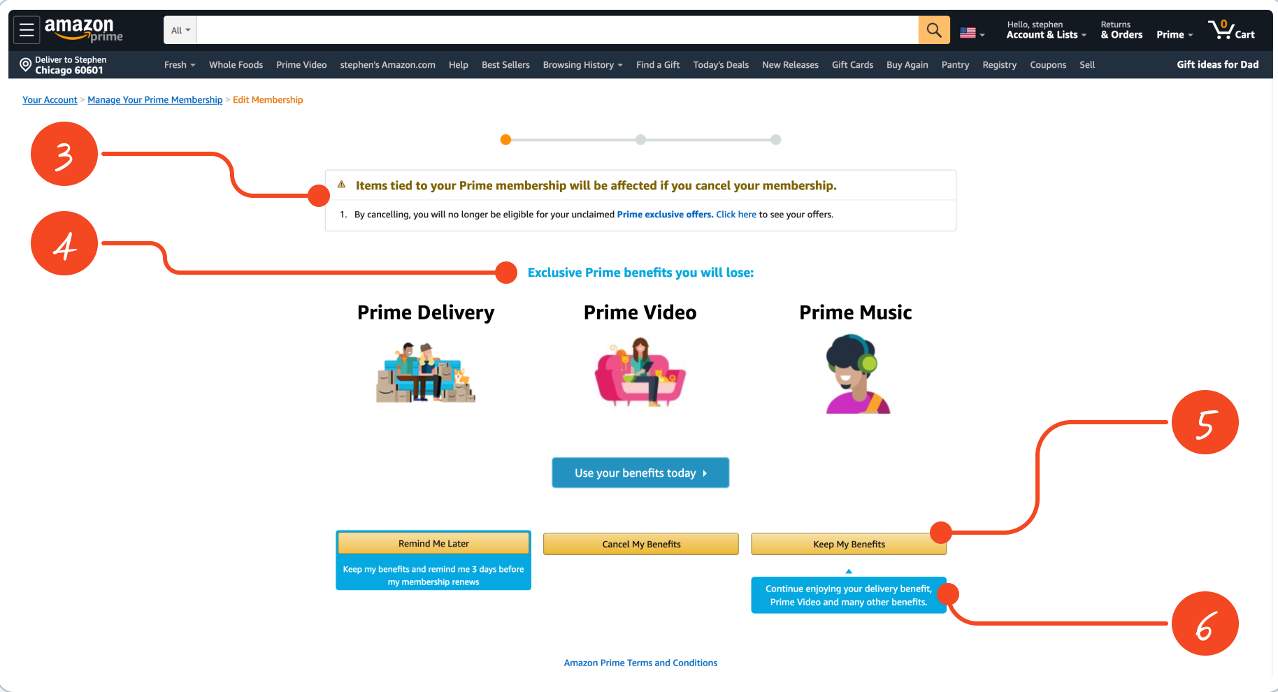
After clicking the button in the manage membership dropdown, we find ourselves here. Just wow. Let's break this page down.
First, scan the page and notice all the headers and various pieces of content. I'm going to guess this is called the "Prime Benefits" page internally because the super-majority of content is trying to tell you all the benefits you're about to lose if you cancel (aka, delivery, video, music).
- The first thing you see on this screen is a header using a warning icon that says you're going to lose something. This plays on the concept of Loss Aversion and Prospect Theory, which says people are more likely to be afraid of losing something than gaining something. For example, a 10% loss in your stock portfolio creates a stronger emotional response than a 10% gain. If you click on the links to see your unclaimed offers, you will exit the cancellation flow entirely and need to start over. This could also be considered a distraction.
- Similarly, most of the content on this page tries to convey everything you will lose if you cancel.
- This is interesting. Here we have three different primary buttons or call-to-actions that all look the same. If you've Amazon long enough, you know this is the same style in their cart and checkout. So which do you pick? This, along with the multiple colors, diagrams, copy, headers, etc., makes for a confusing experience you must actively look through to find your way out. You could argue this could introduce information overload and decision fatigue for someone who isn't very tech-savvy like Grandma.
- Amazon even employs the element of distraction on this page. This fun little blue popup is initially hidden when the page loads but appears when your mouse hovers over the "Cancel My Benefits" button. A last-ditch effort to keep you from continuing on your cancellation odyssey.
So... where's Waldo? Find the "Cancel My Benefits" button between the other two calls to action. This dark pattern is called "misdirection," and that is why the placement of this button is notable. Typically, in a multi-step flow, navigation that takes you to the next screen is on the right side, while navigation to move backward is on the left. I actually clicked the "Keep My Benefits" button on my first attempt, likely because I've been conditioned to do so, and there are visual cues (e.g., orange nav bar) to indicate this is a multi-step flow.
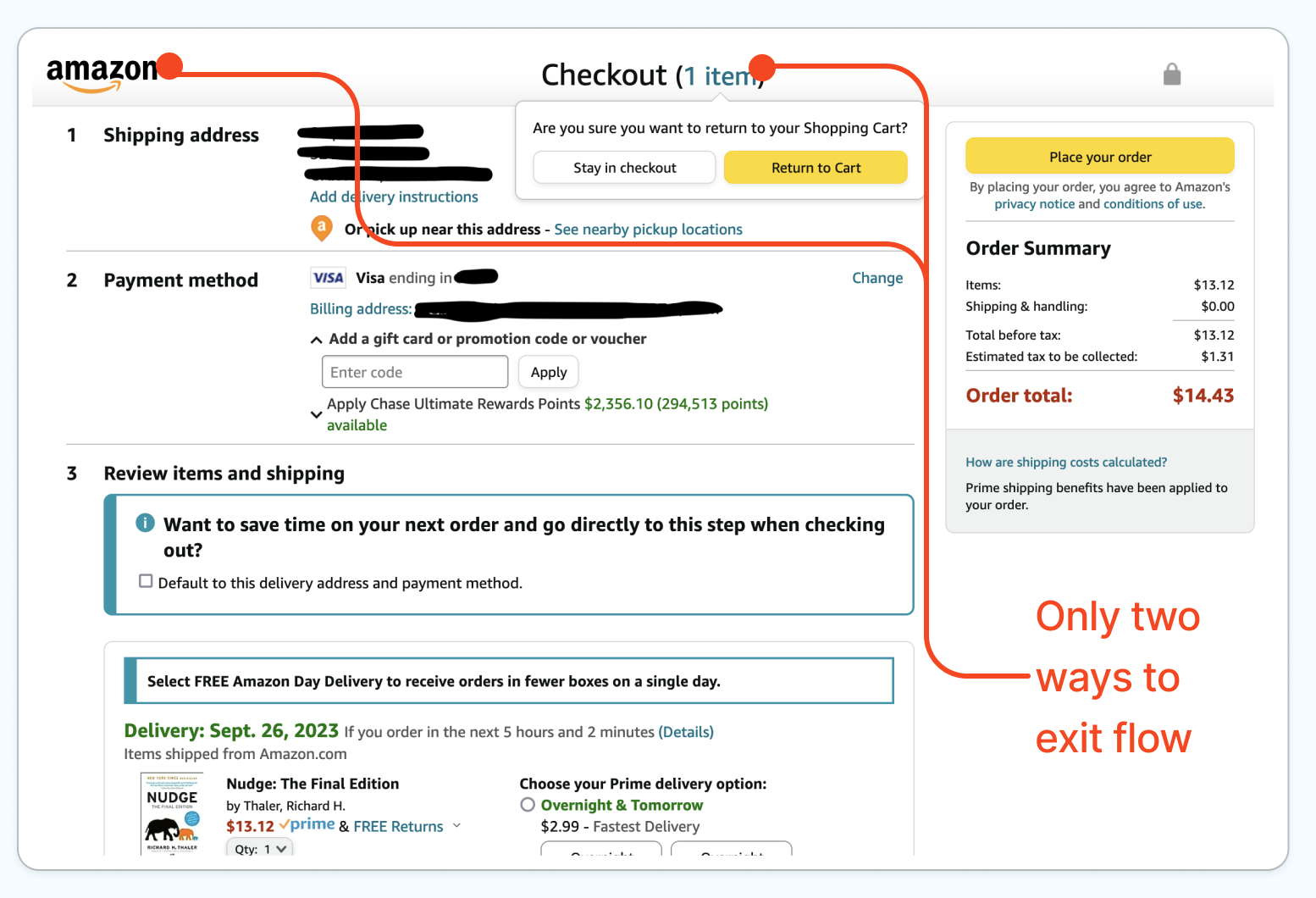
Finally, zoom out and notice how the search bar and primary nav remain. Compare this to Amazon's checkout experience (below), which is another multi-step flow. There is no search bar, categories, or really anything that could distract you or take you out of checkout, and even if you try to leave checkout, you're prompted to make sure you want to leave.
To summarize, there is only one button on this screen that's somewhat hidden that takes you where you want to go, while everything else tells—maybe yells at—you to do something other than click the "Cancel My Benefits" and gives you dozens of opportunities to click something else.
Stats
- Running Click Count: 5 (+1, if you get it right on the first try)
- Running Screen Count: 5 (+1)
Step 3: Prime Benefits -> "Special Offer"
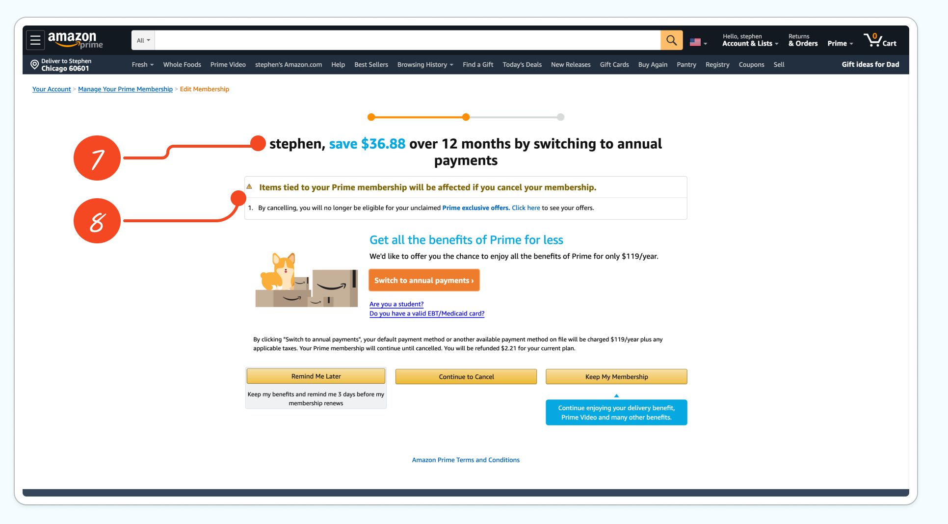
After clicking "Cancel My Benefits," we're brought here to this similarly and intentionally confusing page.
- The header is Amazon is seemingly offering us a deal to stay. If you've ever tried canceling your cable subscription, you've encountered this tactic before., and it's called framing. I was apparently on the monthly plan, I didn't realize it, and I wasn't going to leave the flow to look it up. For people on the monthly plan, this appears to be a discount even though it isn't—it's just the difference between the annualized per-month and annual subscription prices. In fact, annual subscriptions are often better for companies given the longer contractual term, and here they are just offering you the annual subscription cost at face value. It isn't a deal, even though it's worded like it. I didn't test to see if this messaging might be different if I was on the annual plan.
- This familiar warning element appears again because people fear missing out.
I won't go through the rest of this page as it's similar to the prior one from a design perspective. However, it's notable that this page uses a different concept: saving to keep you from canceling right after using the message of losing benefits.
Stats
- Running Click Count: 6 (+1, if you manage to get it right on the first try)
- Running Screen Count: 6 (+1)
Step 4: "Special Offer" ->Cancellation Confirmation
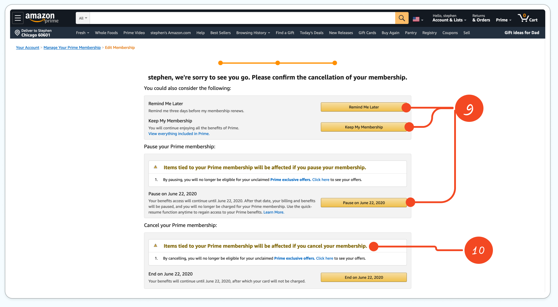
It might not be immediately apparent, but this is the final boss to defeat.
- Here, Amazon is introducing new offers. Going from top-to-bottom, we now have three different things to consider, each using the primary call to action button we've been accustomed to. Remind Me Later, Keep My Membership, and Pause My Membership are all three different concepts that might induce someone to take the final step to reconsider their decision. This could introduce decision fatigue or deteriorating decision quality made by someone after a lengthy decision-making session. Basically, they're hoping by now you'll be exhausted of thinking, give up and keep the dang subscription.
- Amazon uses similarly styled warnings and languages to make it seem like we're losing out on something. Putting our goal at the bottom requires you to scan and read everything.
- Running Click Count: 7 (+1, if you manage to get it right on the first try)
- Running Screen Count: 7 (+1)
Step 5. Cancellation Email
A few minutes later, I received a confirmation email. After opening the email, I see a big yellow button calling me to extend my Prime membership. One could argue that this is really a "Win-Back" email disguised as a confirmation email. The copy and imagery further reinforce a pending but preventable loss of benefits, and you should click the button to avoid incurring this loss.
It took us a lot of screens and clicks to cancel our account, but let's see how many it takes after clicking this button.
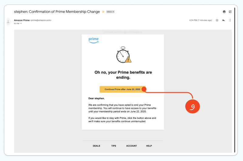
Naturally, it took just one click, and I'm re-subscribed to Prime. It took at minimum seven clicks and seven screens to cancel my subscription, assuming I followed everything perfectly the first time, and it took me one just click to re-subscribe.
Case Analysis
Amazon's Project Illiad created a digital roach motel—it's easy to get in, hard to get out. The unsubscribe process stands in stark contrast to other Amazon experiences, like their patented one-click checkout, which was described back in 2017 on a Wharton Business School podcast episode as a "game-changer" and a "turning point for Amazon." Amazon clearly demonstrated mastery in reducing friction at that time when they wanted you to complete an action—whether that’s buying something or re-joining Prime. However, when it came to unsubscribing from Prime, Amazon clearly added steps and complexity.
From a design perspective, it clearly could work, but was it a needle mover? The FTC suit is heavily redacted, but fortunately, Business Insider reported that Project Illiad reduced Prime's churn rate by as much as 14% in 2017, according to internal documents they received.
Combining this key fact with other publicly available information, we can do some back-of-the-envelop math to estimate the financial impact of Project Illiad. To the model simple:
- Let's assume Project Illiad was implemented by the end of 2016 and affected every Prime subscriber's experience throughout 2017 and beyond.
- Based on the Business Insider wording, let's assume 14% was the maximum reduction in churn, which leveled out to a more conservative 10% reduction.
- Let's also hold the old and new Prime churn rates constant into the future. It's not perfect, but this will attempt to isolate the financial impact of only Project Illiad and ignore the many investments Amazon has made in Prime to add features or new services (e.g., original television/movies) that would improve retention.
- Let's also assume all Prime subscribers pay the same annual price and will work with annual values. This ignores student plans, which would decrease average annual revenue per user (ARPU), and monthly subscribers, increasing ARPU over 12 months. We'll also ignore the effects of the 30-day free trial for simplicity.
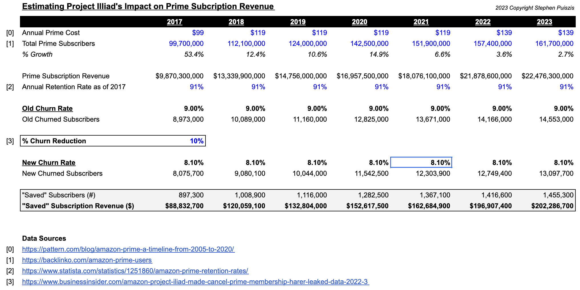
Based on our back-of-the-envelope math, a 10% decrease in churn from Project Illiad could have increased Prime subscription revenue in the United States by $80M in the first year alone. Our estimate could be conservative since Amazon is known to heavily A/B test its site and even provides tools to sellers like "Manage Your Experiments to run their own A/B tests. Realistically, this churn improvement figure likely improved over time. And since Amazon hasn't structurally changed the flow since launching it many moons ago, it also leads me to believe that it's been successful at doing what it set out to do.
Looking at the potential impact of Project Illiad beyond 2017, the saved subscription revenue figures get really big, really fast. Prime has over 150M U.S. subscribers and generated over $30bn in 2022 subscription revenue alone, which is larger than most of the Fortune 500. So, it's not unreasonable to believe that our estimate of prevented churn in 2022—$200M or 0.66% of total subscription revenue—is just the floor.
Part 4: Conclusion and what's next?
The Click-to-Cancel rule is a win for consumers. Assuming it doesn't get watered down through litigation, this new rule should (1) improve user experience transparency, (2) empower consumer choice and increase competition, and (3) reduce unwanted services/charges by making it easier to manage and cancel their subscriptions. The timing is also important — Americans are concerned with inflation, shrinkflation, and enshittification taking place, really everywhere. Even more importantly, dark patterns are becoming more and more utilized. University of Chicago research from 2019 estimates that 1 in 10 e-commerce sites use dark patterns, and it's undoubtedly increased since then, and the new rule should help protect consumers.
Was the Prime cancellation flow over the top? Yes. Compare Project Illiad to Amazon's cart, checkout flows, the one-click re-subscribe flow, or really any other part of the Amazon experience, and it's easy for an average person to conclude that the unsubscribe flow was more confusing and more difficult to navigate.
Was trying to cancel my Prime subscription as painful as spending hours on the phone with a notorious cable company headquartered in Philadelphia to cancel my cable subscription? No. It certainly isn't as bad as this infamous experience one person had. Complex cancelation flows have been a problem for consumers for decades, and the acceleration of commerce on the web only worsened the problem. I'm glad the FTC took action when it did—this is good for everyone.
Well, not quite everyone. If I were the owner of a business with low customer satisfaction relying on one of these high-friction cancellation flows or a gym requiring you to cancel your membership by writing a letter, I'd be concerned. There will be churn.
In the short-term and in preparation of the implementation of the Click-to-Cancel Rule, I expect a wave of "benefit" reminder content and churn reduction initiatives. Businesses will try to remind customers of the value they provide, increase touchpoints with account owners, and look for other cheap, seemingly quick-wins. For businesses where their customers have low switching costs and many available options, they will likely implement loyalty programs or reward systems to try and cheaply incentivize customers to stay with their service rather than look elsewhere.
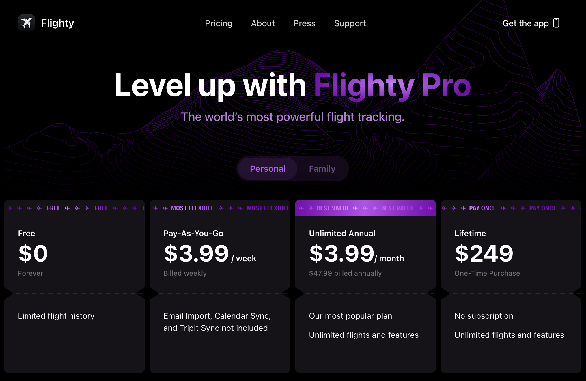
In the longer-term, the new Click-to-Cancel rule will spur some businesses to update their pricing structures or emphasize longer-term contracts. For some software or businesses where it makes sense, especially for B2C software, we might see lifetime subscriptions options—a new twist on the "old" perpetual software license model. One of my favorite consumer apps, Flighty, offers a "lifetime" pay-once option, which is effectively a lifetime subscription, paid up-front. Lifetime subscriptions and the old perpetual software licenses share a fundamental similarity: both offer customers indefinite access to a product or service with a one-time payment rather than ongoing fees. The benefit of this new lifetime subscription model is that the consumer receives continual updates where the old perpetual software license was usually limited to specific versions or version locked.
That said, I expect B2B SaaS with long-term contracts to be less affected by the Click-to-Cancel rule. Corporate clients have their own procurement processes, and cancellation terms are often negotiated rather than taken place through an online cancellation flow.
Subscription businesses will face increased potential legal liabilities moving forward. From the analysis we went through, I expect Amazon to lose its dark patterns lawsuit to the FTC or at least settle it. The FTC clearly chose the largest and most successful eCommerce and subscription business to set an example. I expect the FTC to win on Count IV of their suit, which is a violation of the Restore Online Shoppers' Confidence Act of 2010 ("ROSCA") and, more specifically, section 4.3, "failure to provide simple cancellation mechanism." Ultimately, this will be a warning for the rest of the tech industry, and could set a precedent for class action lawsuits against big companies that continue to utilize roach motels or difficult, unfriendly cancellation policies.
Ultimately, in the long term, businesses will need to invest in their product or service experience, giving customers more reasons to stay now that it's easier to leave. I expect the FTC's policy to create opportunities for startups and product- and design-led companies that lead with a great user experience to succeed. Why?
Bringing this back to Amazon Prime, our simple financial model earlier showed how the roach motel clearly helped, but did Prime really need a roach motel? In 2016, maybe not. Prime was so far ahead of the e-commerce curve then with "free" two-day shipping as part of your subscription. I'd argue definitely not in 2023. The many investments Amazon has made into Prime, especially with streaming, original content, Thursday Night Football, and more, are why Prime's one-year retention rates have increased to 97% as of Q1 2023. Project Illiad certainly affected churn, but I'd argue you don't get to 97% retention rates on 150M subscribers without an excellent product.
Amazon's product strategy has worked. As a fan, Amazon's Thursday Night Football ("TNF") broadcasts have been great, despite often having poor gameplay. For Amazon, TNF is a strong reason for millions of football-crazed Americans to keep their Prime account. Where else can you watch Thursday Night Football? Nowhere else since Amazon has an exclusive deal with the NFL. You must keep your Prime subscription to watch any of the 18 Thursday night games, aside from the one week your local team plays on TNF. That's just enough marginal value for millions of people.
Bloomberg reported in 2022 that TNF attracted a record number of new Prime subscriptions for Amazon.
Amazon.com Inc.’s broadcast of “Thursday Night Football” attracted a record number of new Prime subscriptions for a three-hour period, even beating out events like Cyber Monday and Prime Day, according to an email reviewed by Bloomberg.“By every measure, ‘Thursday Night Football’ on Prime Video was a resounding success,” Jay Marine, Amazon’s vice president in charge of the streaming service, said in the email.
TNF, along with many new and different services and features added to Prime like original television and movies, has made a Prime subscription more valuable and thus less likely for subscribers to churn. Project Illiad simply isn't as important to preventing churn today as it was in 2017. Savvy investments in a better product experience made Prime a more resilient subscription business and reduced the need for Project Illiad.
Consumers will soon more have more freedom to leave their existing subscriptions behind. Long-term success will be determined by giving customers reasons to stay because they want to, not because they're stuck. Better products and experiences, not gimmicks, win customer loyalty.
Additional Sources
- https://www.ftc.gov/system/files/ftc_gov/pdf/amazon-rosca-public-redacted-complaint-to_be_filed.pdf
- https://www.ftc.gov/news-events/news/press-releases/2023/06/ftc-takes-action-against-amazon-enrolling-consumers-amazon-prime-without-consent-sabotaging-their
- https://www.ftc.gov/news-events/news/press-releases/2022/09/ftc-report-shows-rise-sophisticated-dark-patterns-designed-trick-trap-consumers